Logo Usage
Showcase your primary logo, variations for different applications, and clear usage guidelines
Logo Variants
Our logo have a few variants in which it appear:
- Default logo – Where the icon & typeface are together horizontally
This is the default use of our logo - Vertical logo – Where the icon & typeface are together vertically
- Partial – Where the icon or typeface are standalone
- Extra small - Small variants, used anywhere when the size is lower then
32px
For example the icon is used as favicon
Default logo
OK
Vertical logo
OK
Icon only logo
OK
Typeface only logo
OK
Extra small logo
OK
Extra small logo, icon only
OK
Allowed Usage
Primary content
You can use the logo in Primary-Brand everywhere or in White in secondary content
In terms of background colors, you can use the logo in Primary-Brand in following manner everywhere
Logo used on White
OKLogo used on Bright
OKLogo used on Lighter
OKLogo used on Darkest
OKSecondary content
You can use these color combinations as secondary content.
For example, as an additional slide in a presentation or in a footer element. Not as main page in a website or as a cover slide in a presentation.
White logo on Darkest
OK
White logo on Primary-Contrast
OKForbidden Usage
Colors
We can use the logo in many different ways, but there ways we can not, here are some of them
Logo on --color-secondary-brand
Not OKLogo on Tertiary-Brand
Not OKWhite logo on Tertiary-Brand
Not OKWhite logo on --color-secondary-brand
Not OKAny other color then approved
Not OKAny other color then approved
Not OKTreatment
We can use the logo in many different ways, but there ways we can not!
Here are some of them treatment you should avoid:
Don't use any kind of shadow
Not OKDon't use any kind of glow
Not OKDon't place logo over an image
Not OKDon't place logo over a gradient
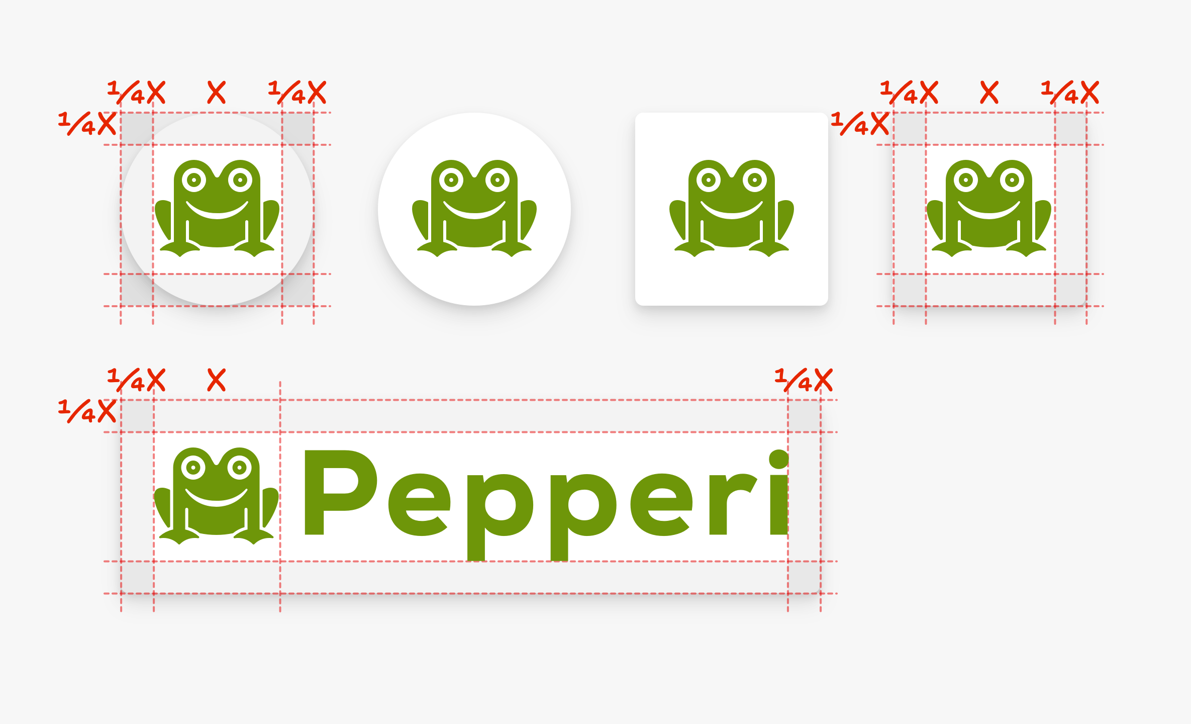
Not OKLogo Sizing
Spacing
The logo and icons should have minimum spacing of 1/4 of the icon size
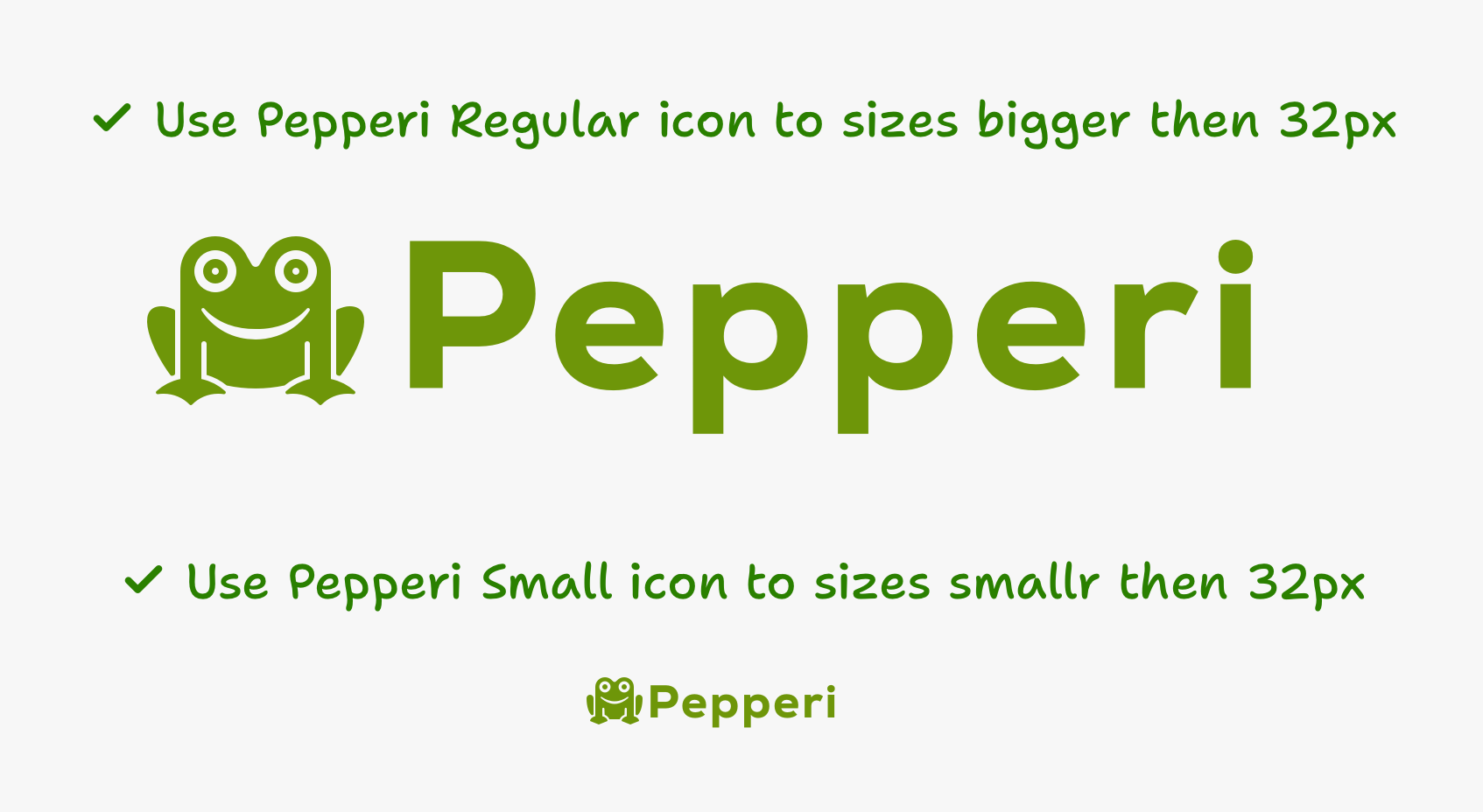
Size variants
When using the logo or icon in size of 32px or above please use the Regular assets
When using the logo or icon in size of 32px or below please use the Small assets
Download assets
General
Here you can find Pepperi logo variations (full logo, icon only, typeface only, vertical formation) as png or svg files
Extra Small
Here you can find our logo in extra-small variant for use when is less then 32px. For example, in a footer or a favicon.
Download extra small logo assets ↓For Print
If in need for print asset please download this or use svg found in the 1fst download.